Friendbase

Improving conversion for a Mobile Videogame

2022

Product Designer

Unity

Table of contents

Table of contents

Table of contents

Introduction

While working as a Product Designer at Optic Power, one of my main projects from 2021 to 2023 was Friendbase, an immersive 2D Virtual World that offers users a platform to create personalized avatars, socialize with others, and engage in mini-games.


During those years, we went through all kinds of adventures. In this post, I'll tell you about my work on improving conversion from 34% to 77%, through user research and iteration.

Problem

Among the few metrics available, there was a disproportionate relationship between downloads and successful registrations. Far more users downloaded the app than those who actually reached the game.

Among the few metrics available, there was a disproportionate relationship between downloads and successful registrations. Far more users downloaded the app than those who actually reached the game.

Downloads

Downloads

Create Account w/

email or Facebook

Create Account w/

email or Facebook

Create Avatar

Create Avatar

Start Playing

Start Playing

Hypothesis

Users are downloading the game but not playing it due to difficulties or barriers encountered during the registration process.

Collecting Quantitative Data

We have a hypothesis; it's time to test it out. To do this, I measured user actions at each step of the registration process, using Amplitude to collect data for both the Email and Facebook Account registration flows.

We have a hypothesis; it's time to test it out. To do this, I measured user actions at each step of the registration process, using Amplitude to collect data for both the Email and Facebook Account registration flows.

Registration with Email

Create account w/ Email

5754

Create Avatar

Start Playing

639

Email was the most popular registration method among our users, and it also had the highest dropout rate.

The first thing I noticed when analyzing the numbers was a significant drop-off at the email verification screen. So, I examined that screen and realized that it acted as a barrier.

The first thing I noticed when analyzing the numbers was a significant drop-off at the email verification screen. So, I examined that screen and realized that it acted as a barrier.

Users couldn’t do anything further within the app; they were forced to leave and confirm their email without even trying the app.

The first column shows the users starting the flow, and the second the drop-off on the verification-of-email step.

The flow stopped here. They had to leave the app, and they didn't come back.

Registration with Facebook

Create account w/ Facebook

1583

Create Avatar

Start Playing

1069

The registration using a Facebook Account offers to the users a simpler and quicker creation account process, and that could be the reason why it’s rate of success is much bigger.

The registration using a Facebook Account offers to the users a simpler and quicker creation account process, and that could be the reason why it’s rate of success is much bigger.

Collecting Qualitative Data

Tracking down users who didn't complete the registration process was not possible, but I still had the opportunity to speak with a few collaborative users. The main discoveries from these discussions were:

Tracking down users who didn't complete the registration process was not possible, but I still had the opportunity to speak with a few collaborative users. The main discoveries from these discussions were:

The first screen did not clearly differentiate between 'Login' and 'Sign In,' causing confusion.

The first screen did not clearly differentiate between 'Login' and 'Sign In,' causing confusion.

Users expected to be able to log in with a Google Account.

Users expected to be able to log in with a Google Account.

There were no clear acceptance criteria for usernames or names.

There were no clear acceptance criteria for usernames or names.

The 'Name' and 'Lastname' fields required a minimum of three characters and were not editable in-game."

The 'Name' and 'Lastname' fields required a minimum of three characters and were not editable in-game."

User Journey Map

To summarize and visually present both quantitative and qualitative data, I created a User Journey Map for both registration processes: Email and Facebook. I shared this with stakeholders and the team to ensure everyone was aligned.


I really enjoy using tools like these to get the whole team on the same page and to foster collaborative ideation.

Solution Proposal

After researching, ideating, leading some workshops, and having a few meetings, I landed on a design solution that I'll explain through its three main features: SSO, Play as a Guest, and reduced steps.

Google and Apple Single Sign-On

Adding Google and Apple accounts was something users were loudly asking for. It's a trustworthy and quicker way to register, and also a standard in the industry.

Adding Google and Apple accounts was something users were loudly asking for. It's a trustworthy and quicker way to register, and also a standard in the industry.

Play as a guest

Introducing a new way to try the game before creating an account.

Play as a Guest

Create Avatar

Start Playing

Guest users can explore the game, but they cannot chat or make friends. This measure ensures security for our users.


To encourage registration, we offer coins to Guest users who sign up—providing some extrinsic motivation 🤑 to complement the intrinsic motivation of not wanting to lose your progress.

Reduced Steps and Minimalistic Design

With Single Sign-On and Play as a Guest options, we are bringing users closer to their (and our) goal: to start playing.


However, there were still many steps—seven, to be precise—that users had to navigate to complete their account setup. Some of these steps involved sharing personal data, which sometimes made them uncomfortable.

This was the original flow. Click it to open view mode and see the screens in detail.

This was the original flow. Open on desktop to open view mode and see the screens in detail.

After extensive discussions, research, and debates with stakeholders and marketing teams, I managed to streamline the process to just one screen with two fields: Username and Birthday, along with one checkbox for accepting the terms and conditions.


Without compromising the characteristic and playful style of the game, I developed a minimalistic new design aimed at helping users focus on their goal: to register quickly and start playing.

Here is my optimized flow. Click it to open view mode and see the screens in detail.

Here is my optimized flow. Open on desktop to open view mode and see the screens in detail.

Results

Once the solution was implemented in production, we started receiving the new numbers.

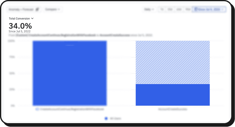
The total conversion rate, encompassing all available registration options, increased from 34% to 77.5%.

Once the solution was implemented in production, we started receiving the new numbers.

The total conversion rate, encompassing all available registration options, increased from 34% to 77.5%.

34%

77.5%

77.5%

77.5%

Now, how we make them stay, engage, play a lot, and come back is a story for another post.

Now, how we make them stay, engage, play a lot, and come back is a story for another post.

Quotes

You have now read about my work from my perspective. To conclude, I’d like to share a few words from the people I worked with:

You have now read about my work from my perspective. To conclude, I’d like to share a few words from the people I worked with:

Melika Sanati

Friendbase Co-founder

"Martin's ability to see the big picture and foresee our needs as a client makes him an invaluable UX/UI designer. His greatest talent is translating client requirements into intuitive and user-friendly designs."

"Martin's ability to see the big picture and foresee our needs as a client makes him an invaluable UX/UI designer. His greatest talent is translating client requirements into intuitive and user-friendly designs."

Tomas Gonzalez

Senior Unity Developer at Friendbase

"As a developer, it always really easy to work with Martin, his designs are awesome and if something needs tweaking or is too complex to code, he finds solutions really quick."

"As a developer, it always really easy to work with Martin, his designs are awesome and if something needs tweaking or is too complex to code, he finds solutions really quick."

Thanks for reading ✨

I hope you had as much fun as I had writing it. Now let's take you back to all the projects.

I hope you had as much fun as I had writing it. Now let's take you back to all the projects.